-
선택 안됨
-
선택 안됨
-
선택 안됨민음사 북디자인, 한글 타이포그래피, 시카고 현대미술관 리디자인, 해외에서 바라본 북한 디자인 책Pics/Design & IllustNowhere Cafe2023-01-29 19:16
-
선택 안됨
국내외 타이포그래피 웹사이드 사용 예시
The Typographic Details Behind Typewolf’s Favorite Sites 자유로운 선이 귀여운 드로잉 일러스트 작업물 모음 #DRAWINGSPics/Design & IllustNowhere Cafe2023-01-29 19:51 선택 안됨 일상을 기록하는 도구, 감좋은 디자인 문
blessingyear.tistory.com
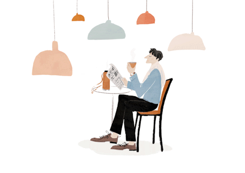
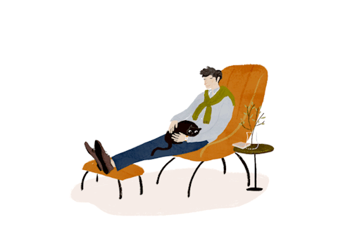
자유로운 선이 귀여운 드로잉 일러스트 작업물 모음 #DRAWINGS
"His simple monochrome drawings manages to convey a rich narrative in black, white and charm." - It's Nice That 일상을 기록하는 도구, 감좋은 디자인 문구 브랜드 & 오프라인 문구샵Pics/Design & IllustNowhere Cafe2023-01-29 19:38 민
blessingyear.tistory.com
일상을 기록하는 도구, 감좋은 디자인 문구 브랜드 & 오프라인 문구샵
미국 대형 문구점 탐방 - 한국 가고 싶게 하는 실용주의 위주 디자인Library/and moreNowhere Cafe2023-01-29 19:05 선택 안됨 해외 디자인 문구 및 영감 사진 모음 (레트로, 빈티지)Pics/Design & IllustNowhere Cafe2023
blessingyear.tistory.com
민음사 북디자인, 한글 타이포그래피, 시카고 현대미술관 리디자인, 해외에서 바라본 북한 디자
한글 레터링, 한글을 그리고 싶다면 이것을 주의하라 한글 레터링 그릴 때 기억해야 하는 두 가지 지금 말씀드릴 것은 한글을 그릴 때 적용되어야 하는 규칙들인데요, 이는 디자인 콘셉트를 더
blessingyear.tistory.com
해외 디자인 문구 및 영감 사진 모음 (레트로, 빈티지)
New Kaweco releases + Gift with purchase 디자인문구 유니크아이템 굿즈샵 일본직구 떡메모지 쇼핑몰 MarketPics/Design & IllustNowhere Cafe2023-01-28 18:17 선택 안됨 해외 문구 브랜딩 센스있는 아이디어 제품 디자
blessingyear.tistory.com
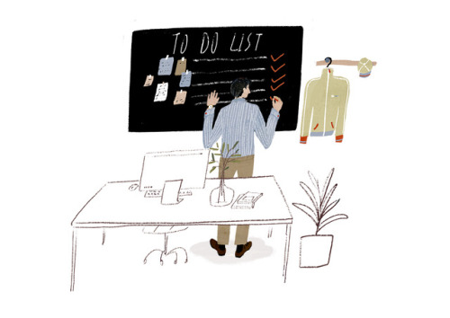
일러스트를 완성하는 가장 효과적인 방법!
우선은 밑그림을 그리기 시작했는데, 무엇을 먼저 그려야 할지, 어떻게 그려야 그림 속 각각의 요소들이 조화롭게 담길지 막막할 때가 있을 거예요. 그래서 완성도 되기 전에 포기하거나, 하더라도 무언가 어색해 보이기도 하죠.
그림에도 기초 체력이 필요해요!
저는 컨셉 아티스트이자 일러스트레이터로서 수많은 기업과 다양한 일을 해왔어요. 그런 제가 그림에 대한 자신감이 붙었던 시점은 바로 크로키 연습을 매일 반복했을 때였습니다. 야근이 일상이던 직장생활을 하면서 자존감이 바닥이던 시절, 하루에 30분씩 크로키 연습을 시작했어요. 그게 반복되어 3년이 되자 실력이 향상되고, 그림에 자신감이 붙었죠.
프로가 알려주는 크로키 스터디 방법
그러나 저처럼 무작정 오래, 많이 그려야 한다는 것이 아니에요. 그림의 기초 원리를 토대로 탄탄하게 그림 습관을 들여야 해요. 제 노하우를 살려, 여러분의 그림 기초 체력이 건강하고 탄탄하게 자리 잡을 수 있도록 차근차근 알려드릴게요. 저와 함께 기초를 함께 배우고 연습하면서, 그림 구상과 구현이 탄탄하고 구체적으로 변할 거예요. 무언가 막막하게 느껴졌을 크로키의 이론부터 효율적인 스터디 방법, 꿀팁까지 모두 공개합니다.
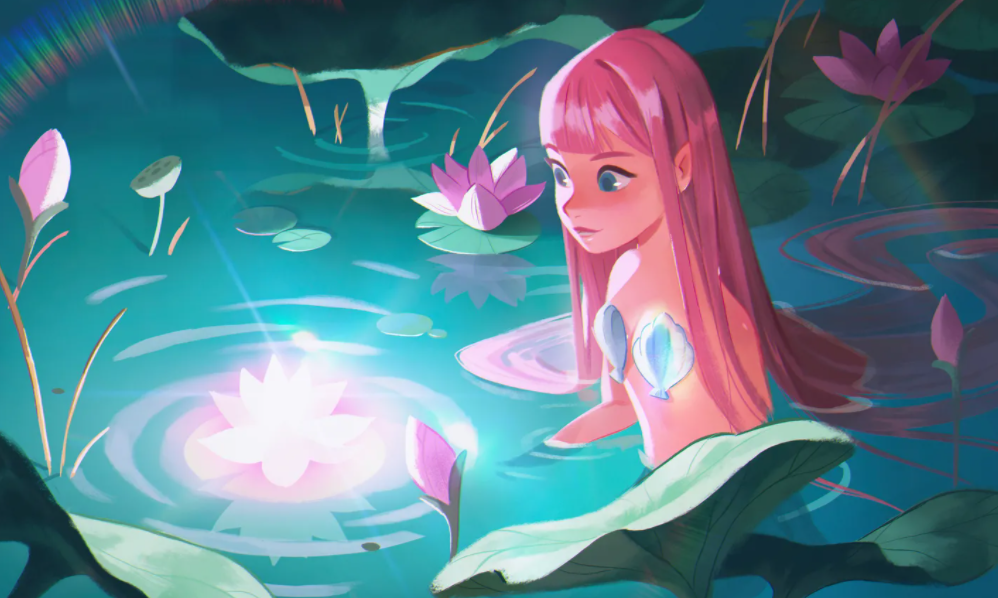
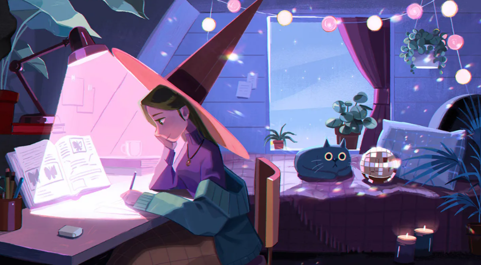
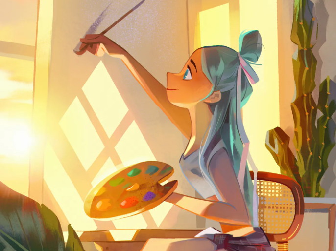
같은 스케치라도 빛과 색을 어떻게 사용하느냐에 따라서, 장면의 분위기는 슬퍼질 수도 포근해질 수도 있답니다. 또한, 같은 사물을 그리더라도 그림의 목적과 의도에 따라 다르게 표현할 수 있고, 배경으로 어떤 소품을 배치하고, 상황을 표현 하는지에 따라 다른 그림처럼 보이기도 하죠.
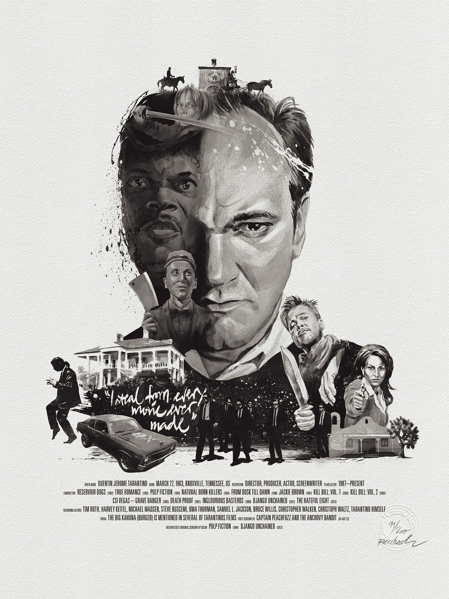
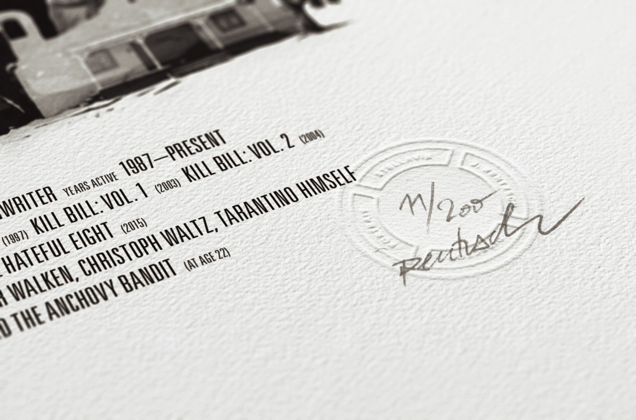
Movie Director Portrait, Quentin Tarantino
« I have loved movies as the number one thing in my life so long that I can't ever remember a time when I didn't. » Quentin Tarantino
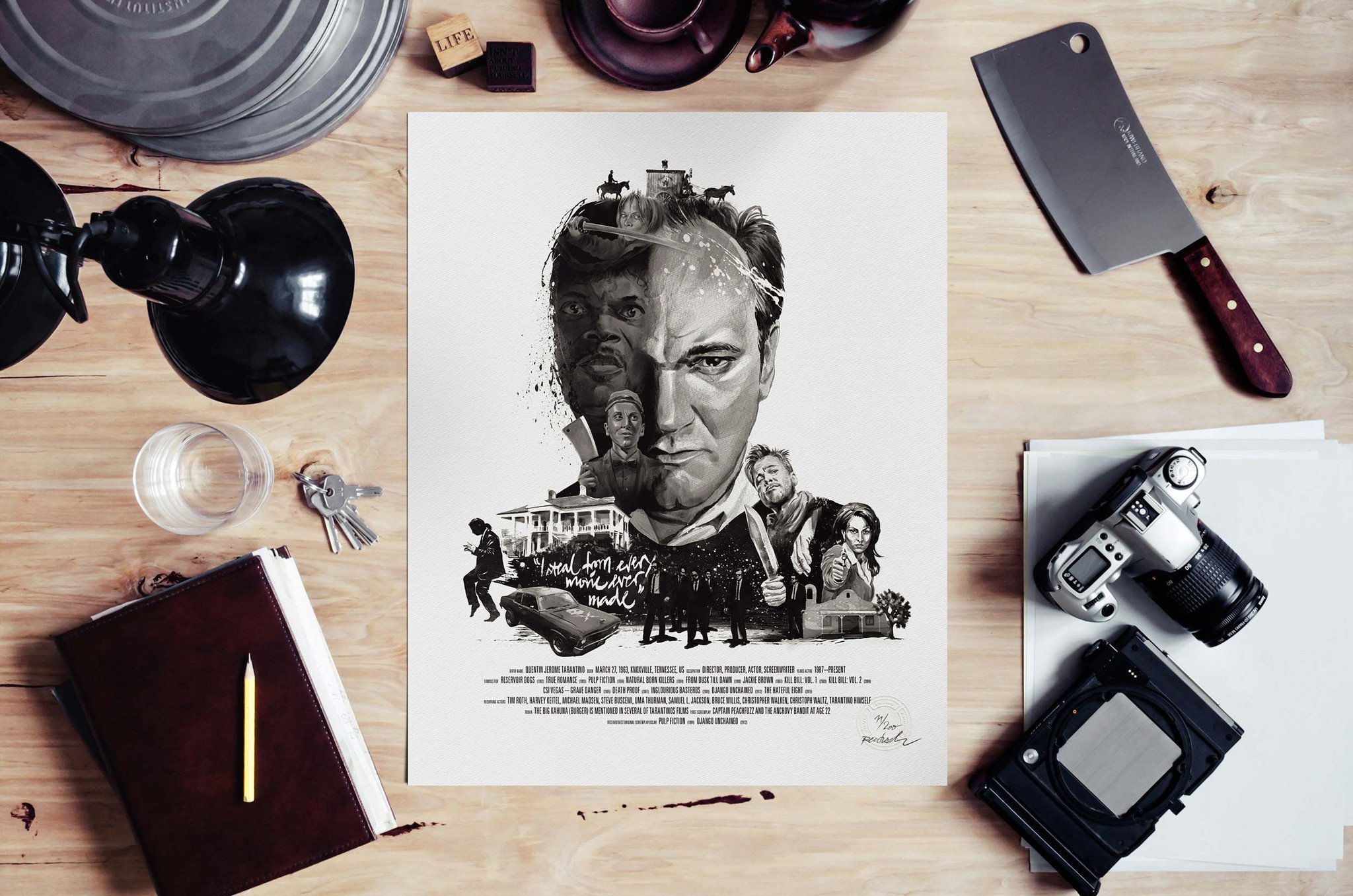
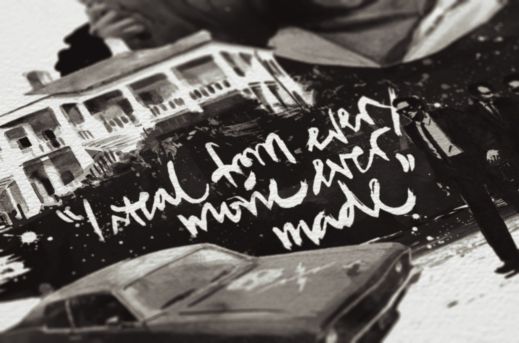
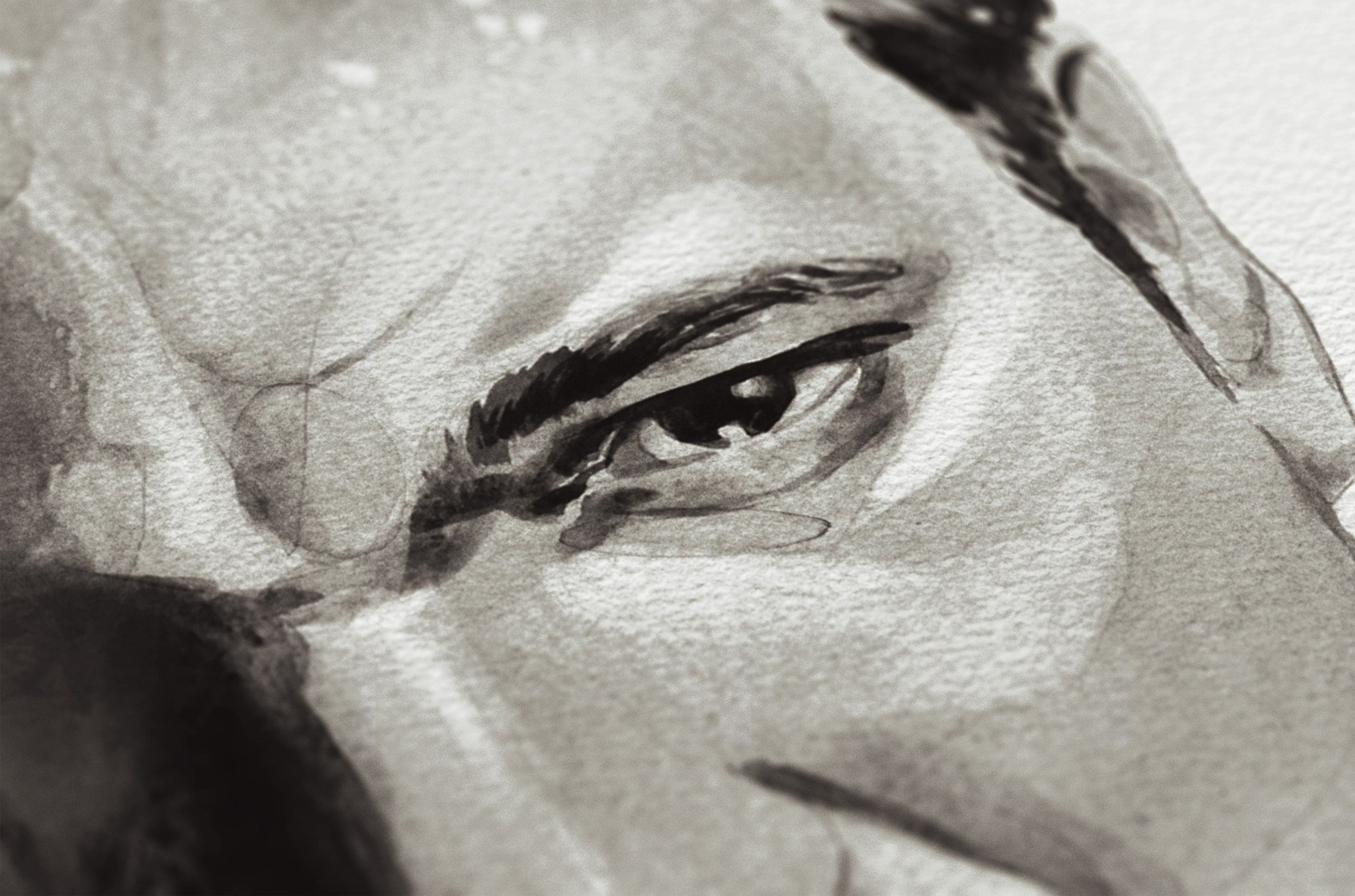
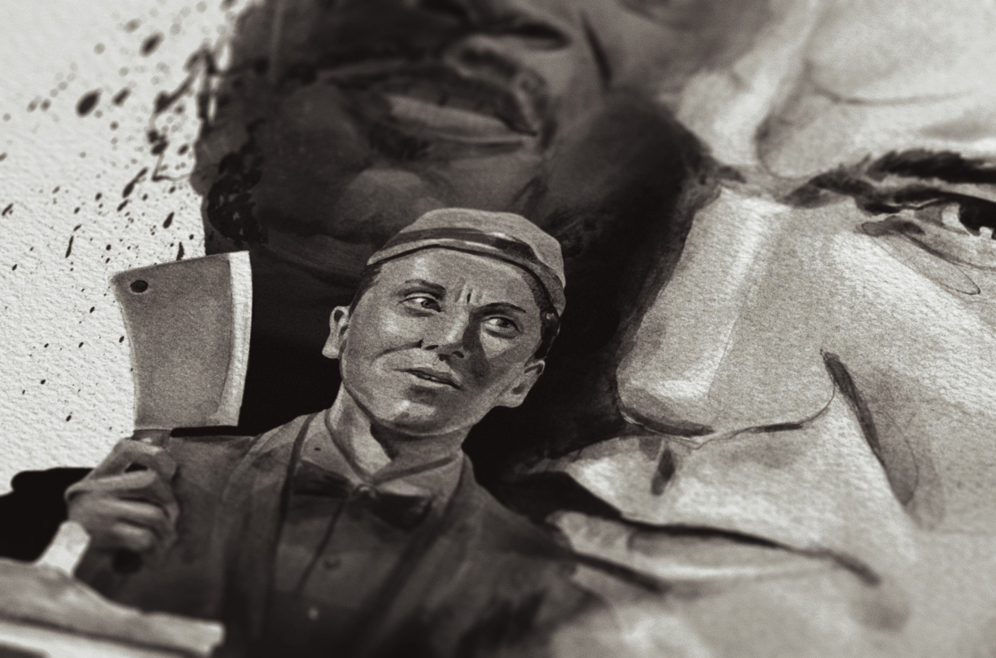
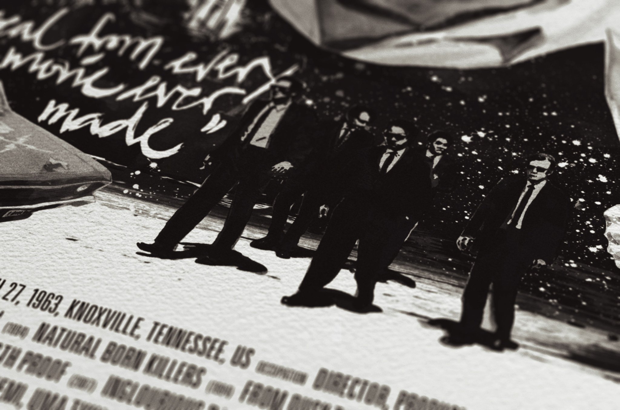
"I steal from every movie ever made". Nobody else in cinema is able to merge the influence of pop culture with the art and aesthetic of poetic violence and unique storytelling as clever as Quentin Tarantino. This portrait illustrates the inventive rebel enlaced with references from his work within the history of cinematography. Developed in close collaboration with Julian Rentzsch, it's the skillfully set typography, an extraordinarily beautiful cotton paper stock and Julians remarkable drawing and illustration skills, both analogue and digital, that truly turn this print into an absolute favorite, not only for hardcore cineasts.
John Grabach – Lines and Colors

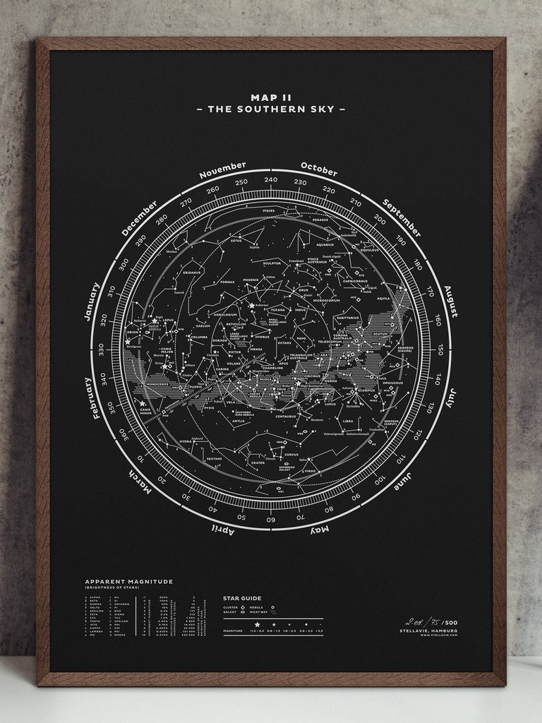
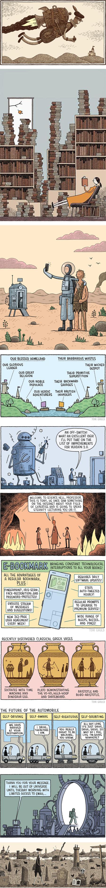
Tom Gauld – Lines and Colors
Michal Jasiewicz

For JaegerLeCoultre卤猫
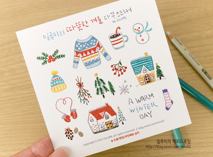
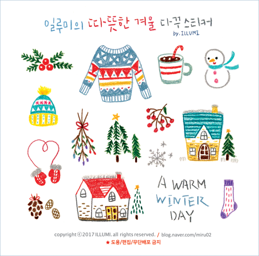
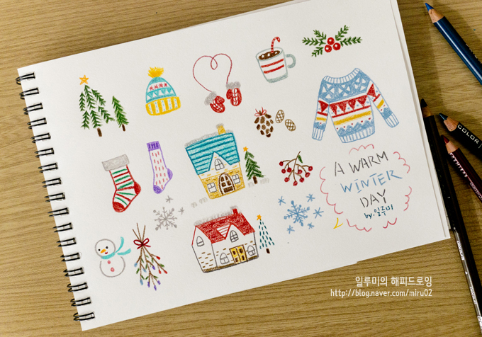
다꾸스티커
'Pics > Design & Illust' 카테고리의 다른 글
| 페이퍼아트로 만든 카페 디저트 메뉴 & 북바인딩 아이디어 (0) | 2023.02.15 |
|---|---|
| 아름다운 폰트, 타이포그래피 디자인 작업물 모음 - 활자 덕후 시절 (0) | 2023.02.02 |
| 국내외 타이포그래피 잘 된 디자인 웹사이트 사용 예시 (0) | 2023.02.02 |
| 자유로운 선이 귀여운 드로잉 일러스트 작업물 모음 #DRAWINGS (0) | 2023.01.29 |
| 일상을 기록하는 도구, 감좋은 디자인 문구 브랜드 & 오프라인 문구샵 (0) | 2023.01.29 |


댓글